Dashboards
Why dashboards matter
Using dashboards allows you to build pre-defined views on your data to always have everything important just one click away.
Sometimes it takes domain knowledge to be able to figure out the search queries to get the correct results for your specific applications. People with the required domain knowledge can define the search query once and then display the results on a dashboard to share them with co-workers, managers, or even sales and marketing departments.
This guide will take you through the process of creating dashboards and storing information on them. At the end you will have a dashboard with automatically updating information that you can share with anybody or just a subset of people based on permissions.
How to use dashboards
Creating an empty dashboard
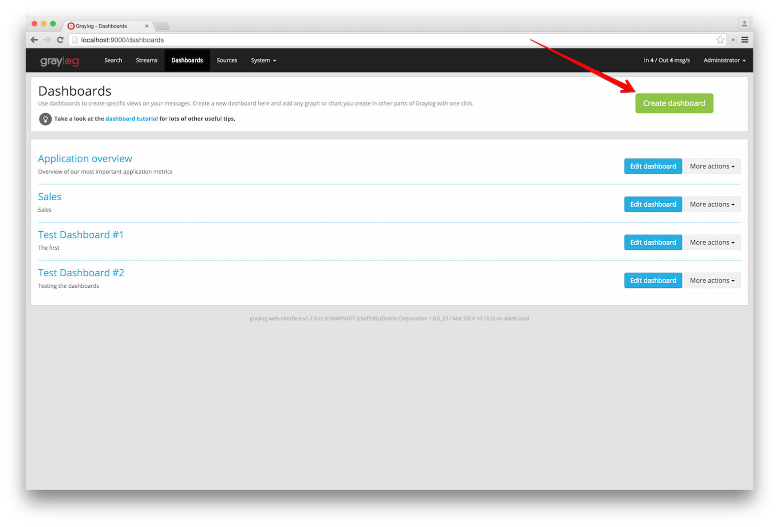
Navigate to the Dashboards section using the link in the top menu bar of your Graylog web interface. The page is listing all dashboards that you are allowed to view. (More on permissions later.) Hit the Create dashboard button to create a new empty dashboard.
The only required information is a title and a description of the new dashboard. Use a specific but not too long title so people can easily see what to expect on the dashboard. The description can be a bit longer and could contain more detailed information about the displayed data or how it is collected.
Hit the Create button to create the dashboard. You should now see your new dashboard on the dashboards overview page. Click on the title of your new dashboard to see it. Next, we will be adding widgets to the dashboard we have just created.
Adding widgets
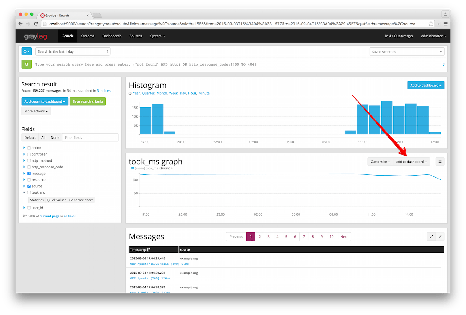
You should have your empty dashboard in front of you. Let’s add some widgets! You can add search result information to dashboards with a couple of clicks. The following search result types can be added to dashboards:
- Search result counts
- Search result histogram charts
- Statistical values
- Field value charts
- Stacked charts
- Quick values results
You can learn more about the different widget types in Widget types explained.
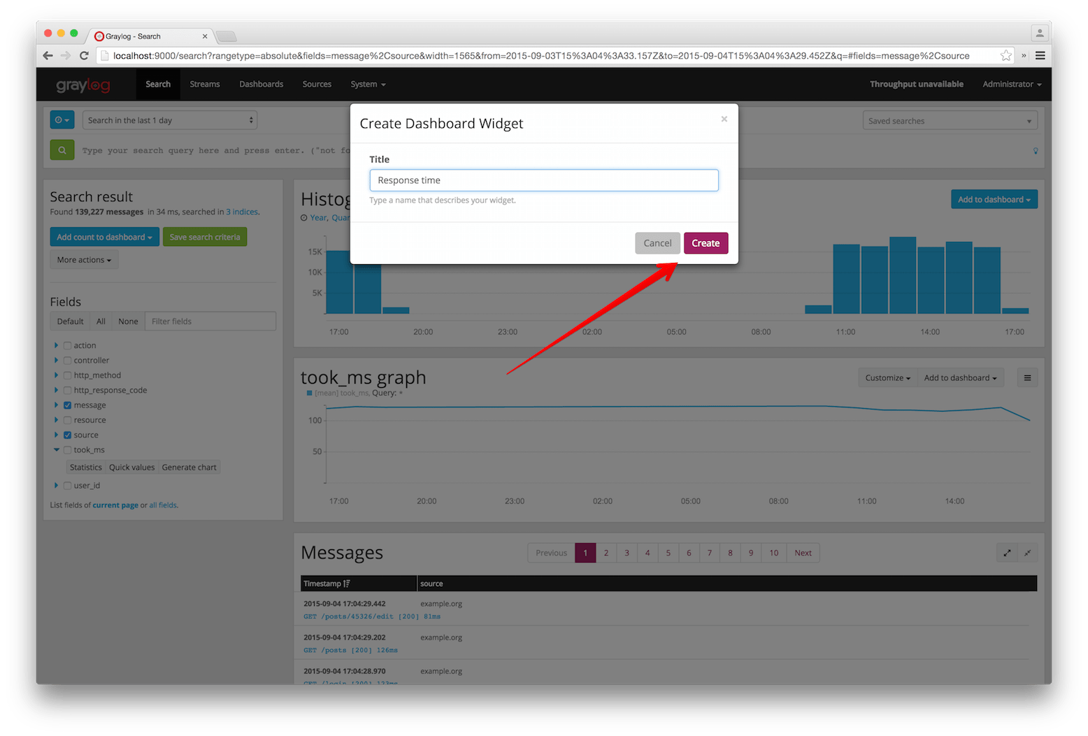
Once you can see the results of your search, you will see buttons with the “Add to dashboard” text, that will allow you to select the dashboard where the widget will be displayed, and configure the widget.
Examples
It is strongly recommended to read the getting started guide on basic searches and analysis first. This will make the following examples more obvious for you.
- Top log sources today
- Example search:
*, timeframe: Last 24 hours- Expand the
sourcefield in the sidebar and hit Quick values- Add quick values to dashboard
- Number of exceptions in a given app today
- Example search:
source:myapp AND Exception, timeframe: Last 24 hours- Add search result count to dashboard
- Response time chart of a given app
- Example search:
source:myapp2, any timeframe you want- Expand a field representing the response time of requests in the sidebar and hit Generate chart
- Add chart to dashboard
Widgets from streams
You can of course also add widgets from stream search results. Every widget added this way will always
be bound to streams. If you have a stream that contains every SSH login you can just search for everything
(*) in that stream and store the result count as SSH logins on a dashboard.
Result
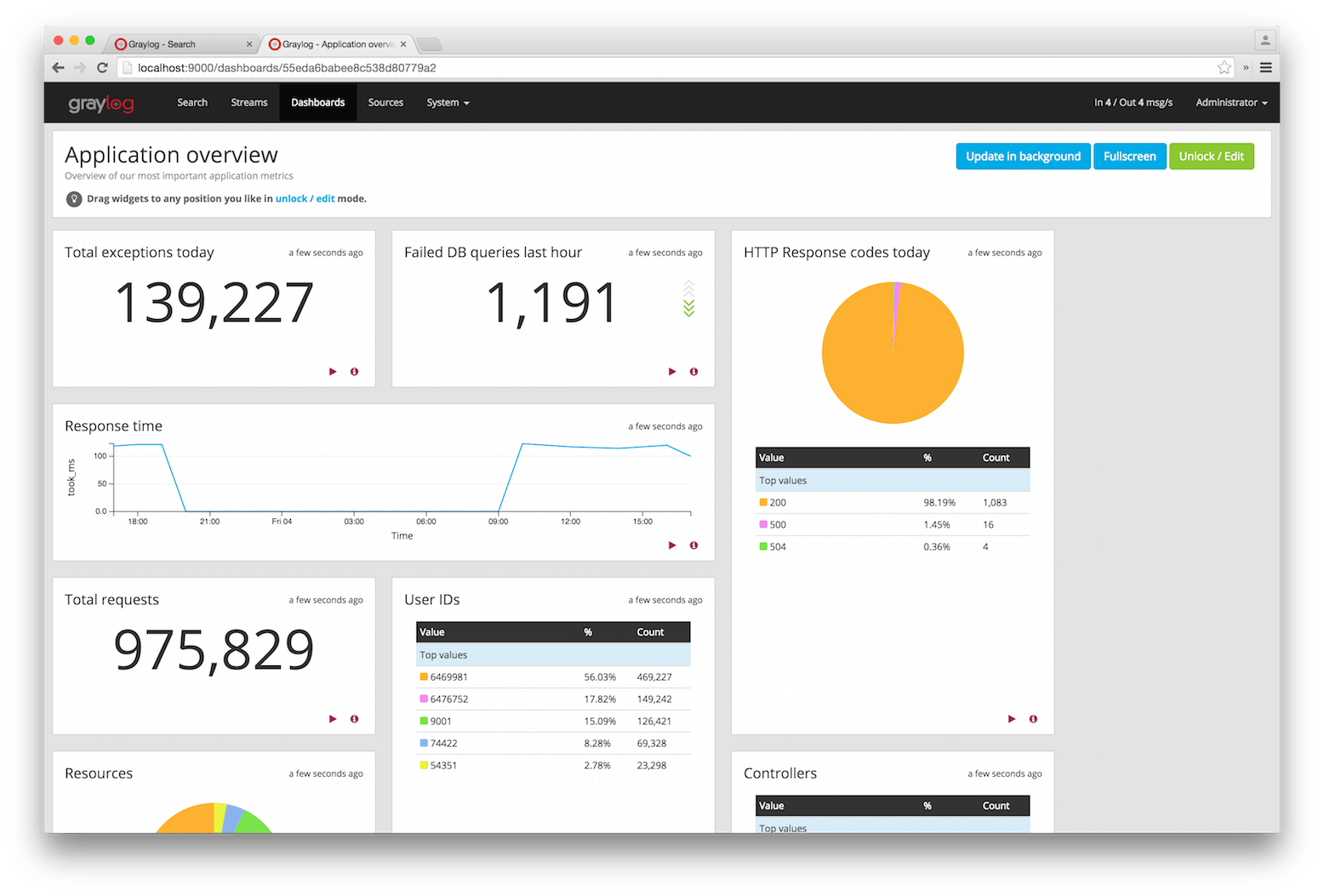
You should now see widgets on your dashboard. You will learn how to modify the dashboard, and edit widgets in the next chapter.
Widget types explained
Graylog supports a wide variety of widgets that allow you to quickly visualize data from your logs. This section intends to give you some information to better understand each widget type, and how they can help you to see relevant details from the many logs you receive.
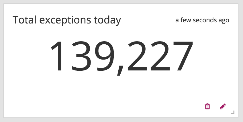
Search result counts
This kind of widget includes a count of the number of search results for a given search. It can help you to quickly visualize things like the number of exceptions an application logs, or the number of requests your site receives.
All search result counts created with a relative time frame can additionally display trend information. The trend is calculated by comparing the count for the given time frame, with the one resulting from going further back the same amount of time. For example, to calculate the trend in a search result count with a relative search of 5 minutes ago, Graylog will count the messages in the last 5 minutes, and compare that with the count of the previous 5 minutes.
Search result histogram charts
The search result histogram displays a chart using the time frame of your search, graphing the number of search result counts over time. It may help you to visualize how the number of request to your site change over time, or to see how many downloads a file has over time.
Changing the graph resolution, you can decide how much time each bar of the graph represents.
Statistical values
You can add to your dashboard any statistical value calculated for a field. This may help you to see the mean time response for your application, or how many unique servers are handling requests to your application, by using the cardinality value of that field. Please refer to Field statistics for more information on the available statistical functions and how to display them in your searches.
As with search result counts, you can also add trend information to statistical value widgets created with a relative time frame.
Field value charts
To draw an statistical value over time, you can use a field value chart. They could help you to see the evolution of the number of unique users visiting your site in the last week. In the Field graphs section we explain how to create these charts and ways you can customize them.
Stacked charts
Stacked charts group several field value charts under the same axes. They let you compare different values in a compact way, like the number of visits to two different websites. As explained in Field graphs, stacked charts are basically field value charts represented in the same axes.
Quick values results
In order to show a list of values a certain field contains and their distribution, you can use a quick value widget. This may help you to see the percentage of failed requests in your application, or which parts of your application experience more problems. Please refer to Quick values to see how to request this information in your search result page.
The quick values information can be represented as a pie chart and/or as a table, so you can choose what is the best fit for your needs.
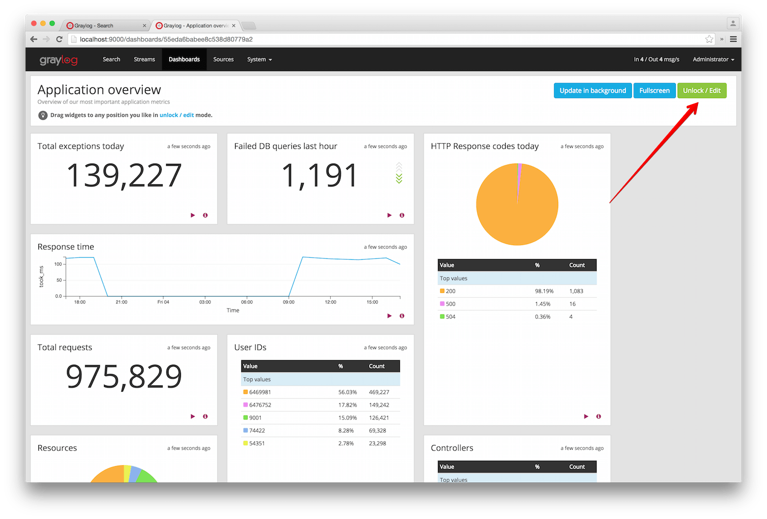
Modifying dashboards
You need to unlock dashboards to make any changes to them. Hit the “Unlock/Edit” button in the top right corner of a dashboard to unlock it. You should now see different icons at the bottom of each widget, that allow you to perform more actions.
Unlocked dashboard widgets explained
Unlocked dashboard widgets have two buttons that should be pretty self-explanatory.
- Delete widget
- Edit widget configuration
- Change widget size (when you hover over the widget)
Widget cache times
Widget values are cached in graylog-server by default. This means that the cost of value computation
does not grow with every new device or even browser tab displaying a dashboard. Some widgets might need
to show real-time information (set cache time to 1 second) and some widgets might be updated way less often
(like Top SSH users this month, cache time 10 minutes) to save expensive computation resources.
Repositioning widgets
Just grab a widget with your mouse in unlocked dashboard mode and move it around. Other widgets should adopt and re-position intelligently to make place for the widget you are moving. The positions are automatically saved when dropping a widget.
Resizing widgets
When hovering over a widget, you will see that a gray arrow appears in its bottom-right corner. You can use that icon to resize widgets. Their contents will adapt to the new size automatically!
Dashboard permissions
Graylog users in the Admin role are always allowed to view and edit all dashboards. Users in the Reader role are by default not allowed to view or edit any dashboard.
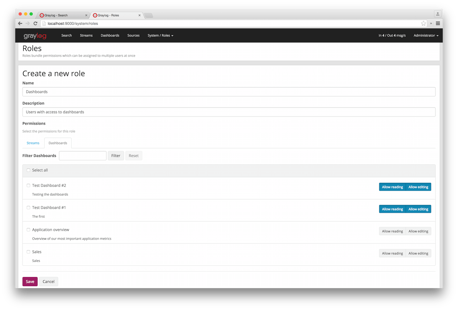
Navigate to System -> Roles and create a new role that grant the permissions you wish. You can then assign that new role to any users you wish to give dashboard permissions in the System -> Users page.
You can read more about user permissions and roles.
That’s it!
Congratulations, you have just gone through the basic principles of Graylog dashboards. Now think about which dashboards to create. We suggest:
- Create dashboards for yourself and your team members
- Create dashboards to share with your manager
- Create dashboards to share with the CIO of your company
Think about which information you need access to frequently. What information could your manager or CIO be interested in? Maybe they want to see how the number of exceptions went down or how your team utilized existing hardware better. The sales team could be interested to see signup rates in realtime and the marketing team will love you for providing insights into low level KPIs that is just a click away.